Styling 3D Tiles in Cesium Stories
This tutorial will walk you through how to use the styling editor in Cesium Stories. We’ll be creating a map to visualize the age of every building in New York City, but you can apply these same concepts to style any other type of 3D Tiles such as point clouds.
You’ll learn how to:
- Add Cesium curated 3D data to a story
- Color features in your 3D content based on different types of metadata
- Share an annotated story on the web
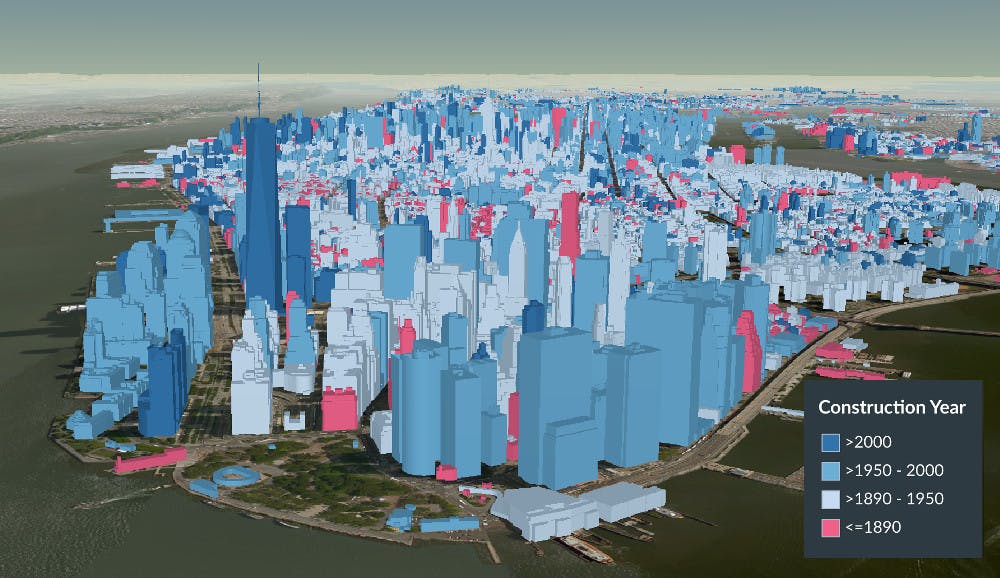
Visualizing the age of every building with styling in Cesium Stories. See a demo of what you can do with styling.
We’ll start by adding the New York City 3D Buildings to your Cesium ion account.
First, sign up or login to Cesium ion.
Then navigate to the Asset Depot. This is where you can find assets we’ve curated that are ready to use in your stories.
Search for New York City 3D Buildings, select it, and then click Add to my assets as shown below.
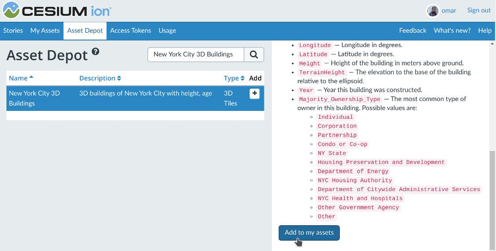
This tileset is now ready to use in your story.
Navigate to the Stories tab and then click the New Story button:
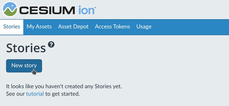
This will open the Stories editor. Your story includes Cesium OSM Buildings by default, a global 3D buildings layer with rich metadata. This is a great base to provide urban context anywhere in the world, or to complement your own data.
Our story is about visualizing the age of buildings in NYC, so we’re going to replace Cesium OSM Buildings with an asset from the NYC Open Data portal that has the feature data we need.
Click the trash icon in your assets list on the left to remove Cesium OSM Buildings from this story:
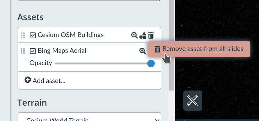
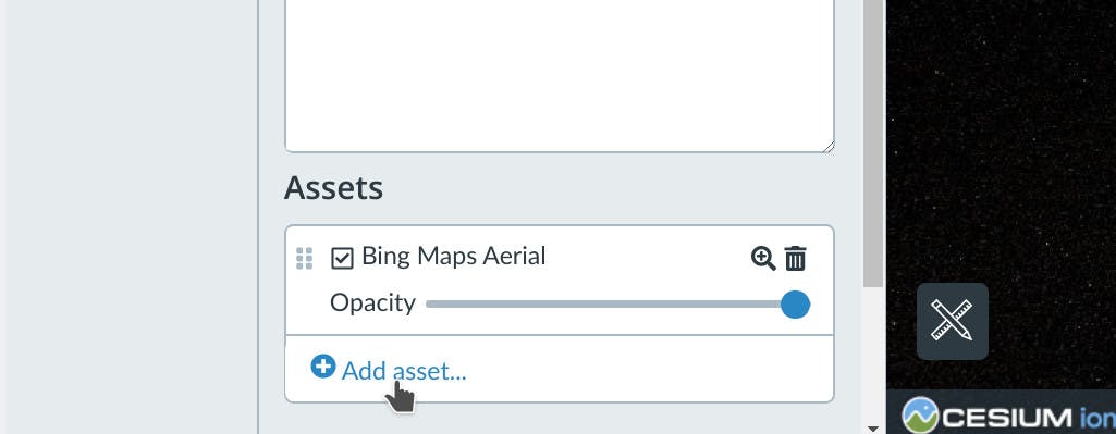
Now add the NYC buildings by clicking Add asset:
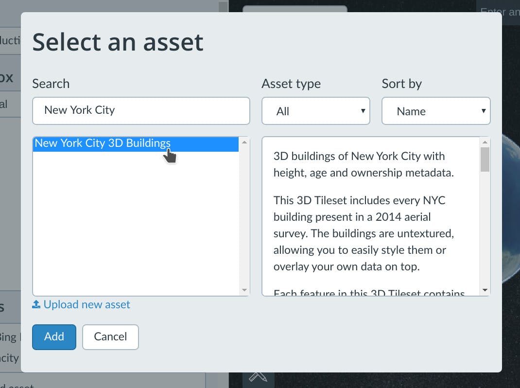
Find the New York City 3D Buildings tileset, and then click Add.
You’ve now added this 3D Tileset to your story. To actually see it, we’ll need to move the camera closer. Click on the magnifying glass icon next to the asset’s name to automatically zoom to it.
You can move and tilt the camera with your mouse, touch screen or the widgets in the top right to get a nice overhead shot of Manhatten as shown below.
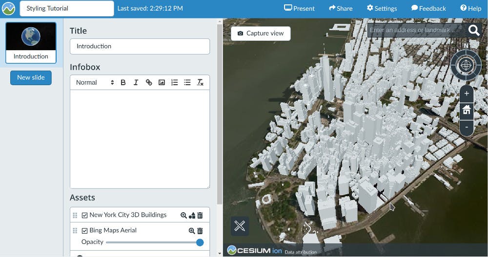
Finally, click the Capture View button to save the camera position on this slide.
Now that we’ve added some data to our story, let’s look at how to style it.
To access the styling editor, click the styling icon styling icon next to the asset’s name. A 3D Tileset must have some per-feature metadata for this button to become available.
In the styling editor, click New style:
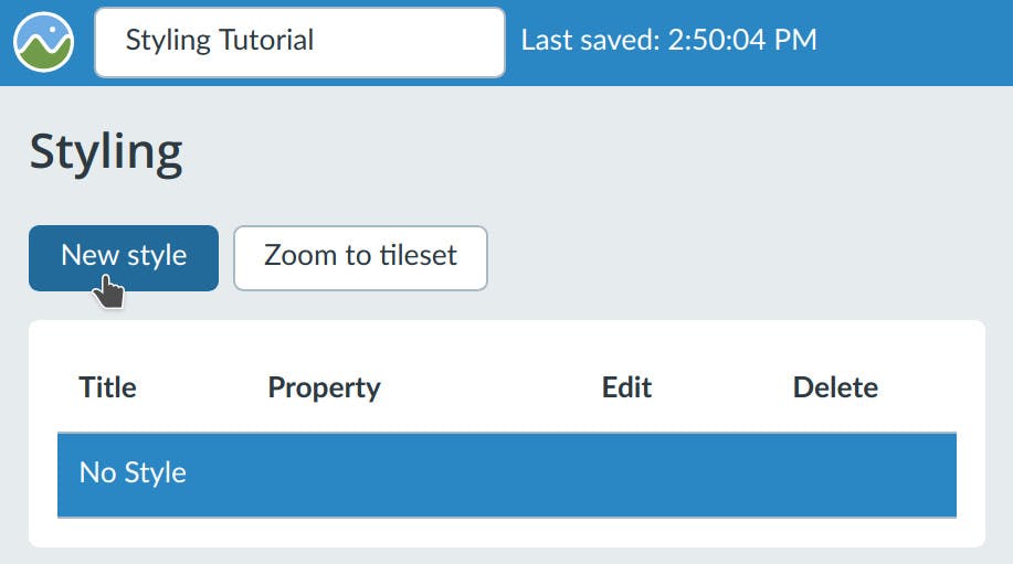
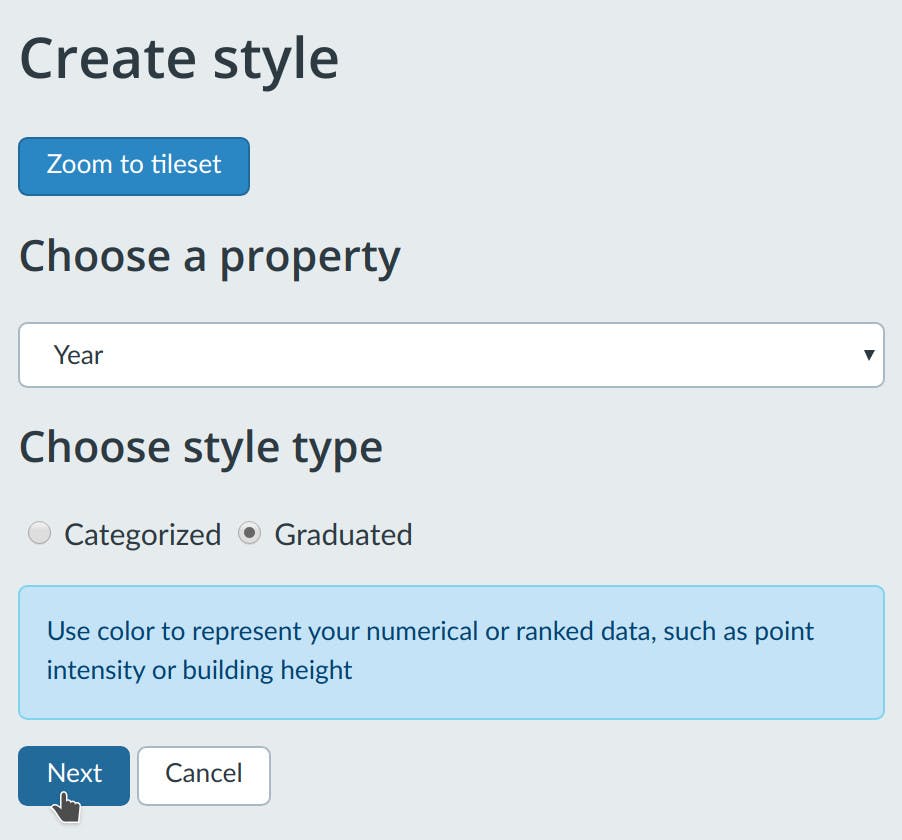
Here you can choose which metadata property you’d like to use for styling.
Select Year from the property drop-down. Select Graduated for the style type, since we’re styling a continuous numerical value.
This building dataset was generated from a 2014 aerial survey, so set the upper limit to 2014 and then set the lower limit to 1890 as shown below.
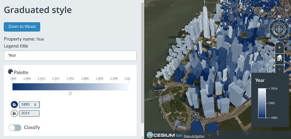
You’ve now created a style that colors each building based on its age - the older the building, the darker the blue.
Click Okay in the bottom left to save this style. Click Okay again to apply that style to this tileset.
Applying a style is a great way to reveal patterns across the entire tileset. If you want to see data on any individual feature, like a building, you can click on it and select the View info about button:
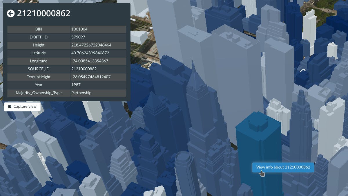
This way you can see exactly what year this particular building was constructed in. You can do this type of inspection on any asset that has defined features like 3D Tiles, KML, GeoJSON, or CZML.
If your feature data has any field that is called or contains “name”, it will automatically be used as the title of the Infobox when selecting that feature.
If no “name” field is found, Cesium Stories will look for fields that are called “title”, “id”, or “identifier”. In the New York City tileset, the title of the Infobox is the SOURCE_ID because that’s the first field found that contains “id”.
One problem with the style we just created is that it’s hard to tell exactly where a given building is on the color spectrum since it’s a continous gradient. Let’s modify this style to define discrete buckets so we can distinguish exactly where the oldest buildings are.
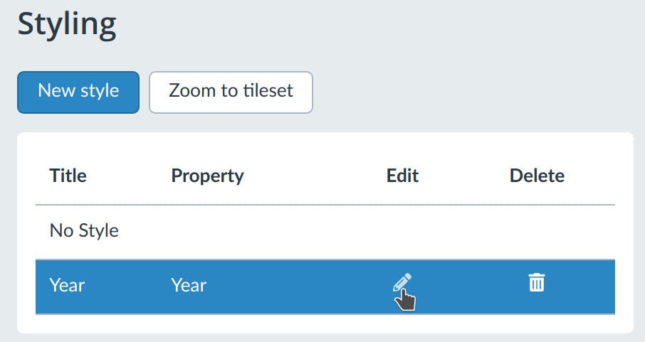
To edit a style, first go back to the styling editor by clicking on the styling icon styling icon next to the asset’s name, then click the edit button on the style we just created:
Pick a new color palette by clicking on Palette in the top left. Select one that has two distinct colors on both ends to create a stronger contrast between the oldest and the newest buildings. We’ve chosen the red-blue one below:
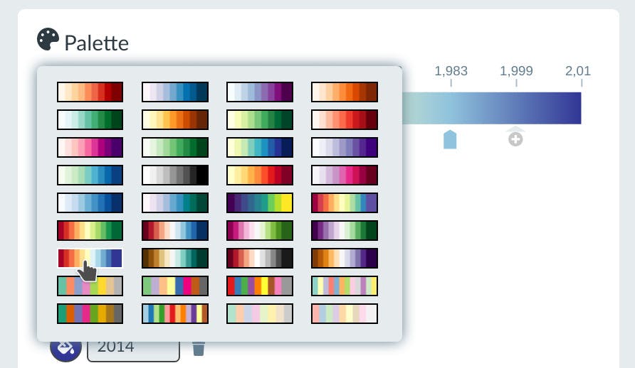
This will automatically break up your range into 5 equal segments. You can modify the color and value of each segment at any time, as well as delete or add new segments.
Click the Classify toggle. This will change the style from a gradient to discrete blocks:
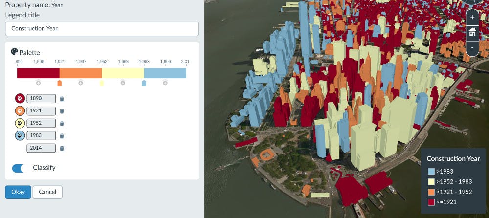
Edit the legend title to Construction Year instead of Year to make it clearer what this is visualizing.
Finally click Okay to save, then Okay to apply the style.
You’ve now created a style that makes it easy to see where the oldest and newest buildings are.
Any style you create in the style editor can be re-used across different 3D Tilesets or different stories. So you can apply this same style to 3D buildings of a different city to easily compare.
This way you can make modifications to your style like we just did without having to go back through every dataset that uses it to update it.
The last type of metadata we’ll look at is categorical data. Each building in this 3D Tileset is categorized by the most common type of owner license. We’ll create a style to visualize which buildings have more units that are owned by individuals vs corporations.
Assets can have a different style applied in each slide. Create a new slide for the new style we’re about to create by clicking New Slide and selecting Map slide under the slides list on the left.
Go into the styling editor again, click New style and then select Majority_Ownership_Type from the properties drop-down.
This time we’ll choose Categorized as the style type.
One category for this property is Individual. Enter that into the value and label field and then click the plus button:
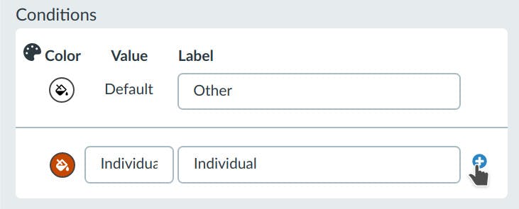
The value field should contain the exact value you’re matching against in the dataset, so this is case-sensitive. The label field can be whatever meaningful name you want to display in your legend.
Fill in two more categories, Corporation and Other Government Agency as shown below.
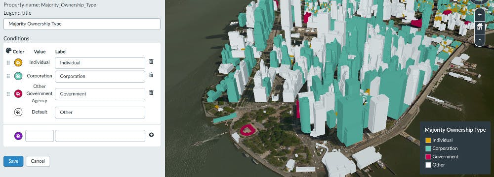
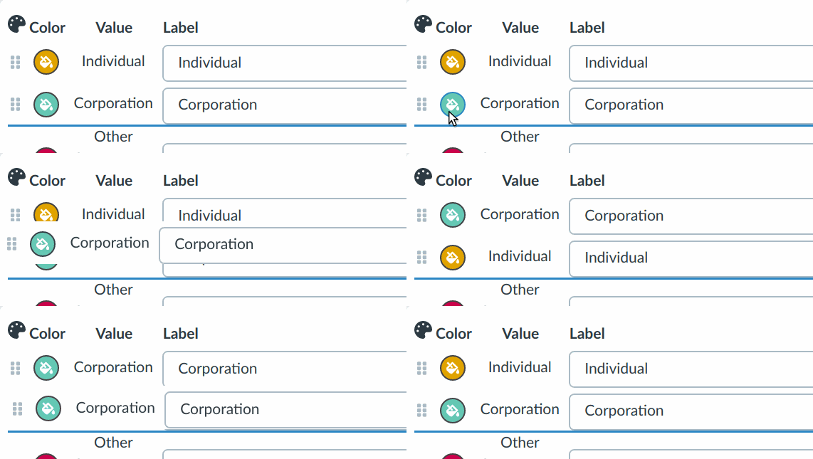
Edit the legend title to remove the underscores, so it’s called Majority Ownership Type. You can also re-order the legend items by dragging the rows:
Click Save, then Okay to apply the style.
You can now visualize how Manhatten has a greater number of corporate ownership compared to individual ownership. Can you find other areas in the city where this trend is reversed?
Try creating a few more slides to capture any interesting patterns that you find.
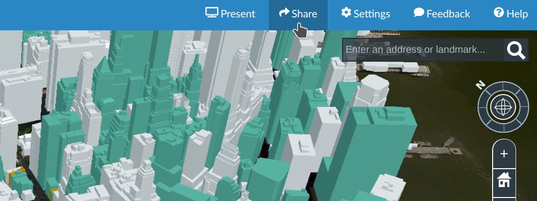
Once you’re ready to share your presentation, click the Share button in the top right:
Give your story a title like Exploring New York City’s Building Data.
Then toggle the Enable Sharing button:
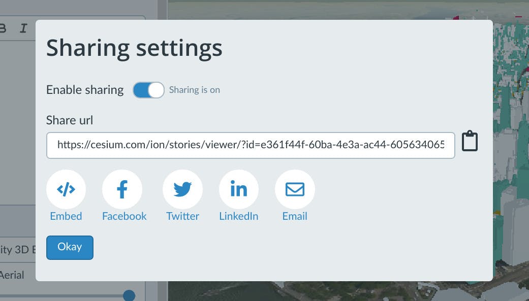
You can now share this URL to show your presentation in the Stories viewer.
Next steps
Now that you’ve learned how to use the style editor, try it with your own data by uploading it to Cesium ion. Or check out what else you can do with Cesium Stories in our tutorial.
If you have any questions or feedback we’d love to hear from you!